Lucy Van Der Gucht BA (Hons) Graphic Design
Hi I’m Lucy
I work across a range of disciplines, I enjoy bright colours, abstract shapes and have recently discovered a strong love for typography in my latest project. I think my approach to design is quite varied as I don't feel that I sit within one specific design discipline.
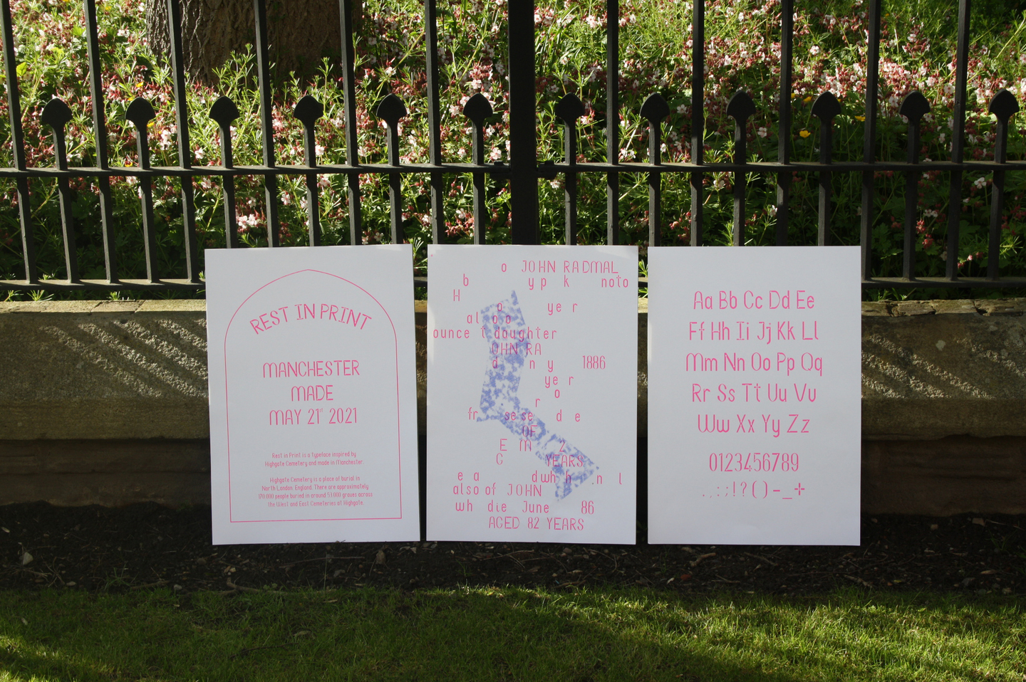
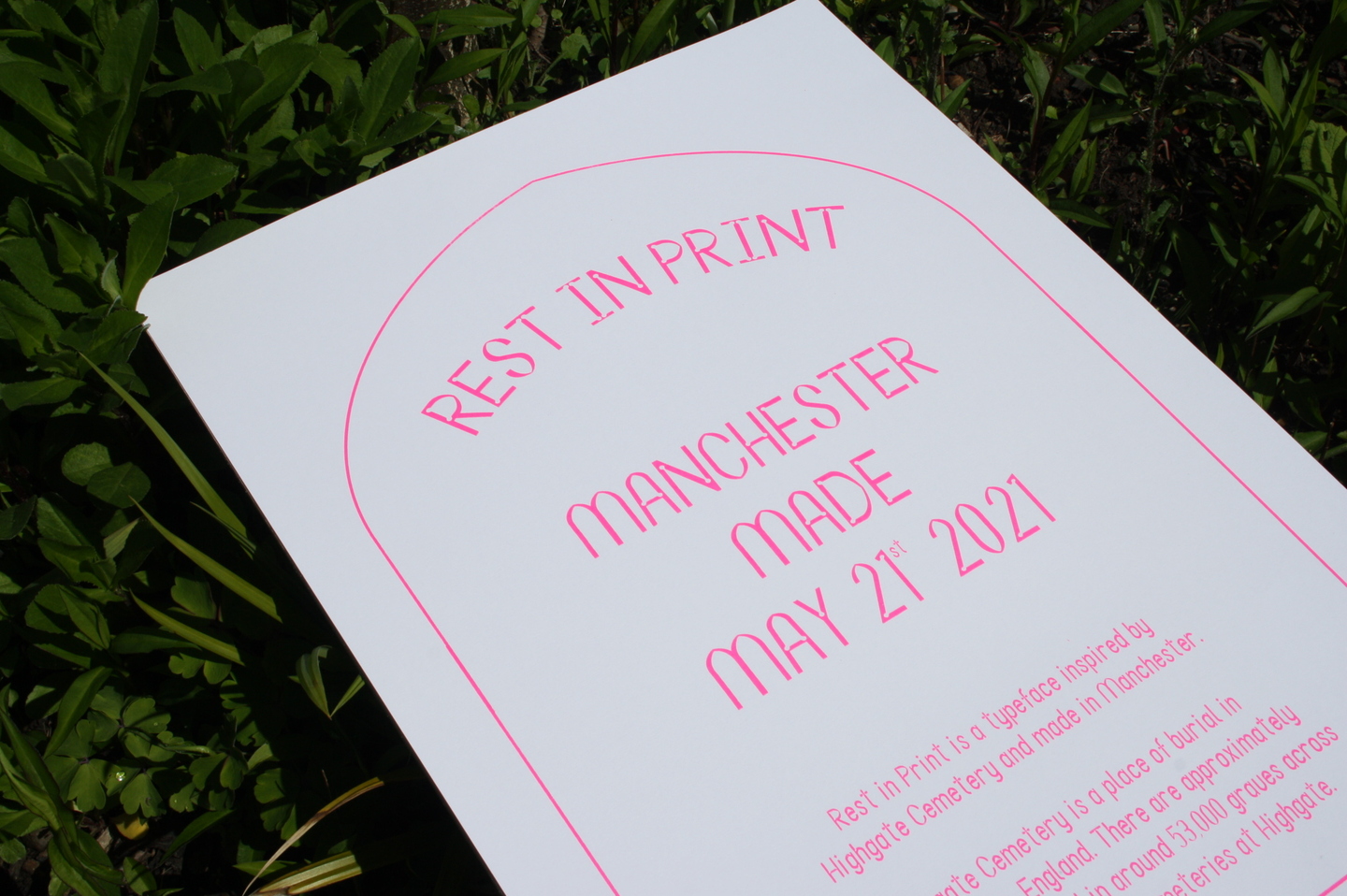
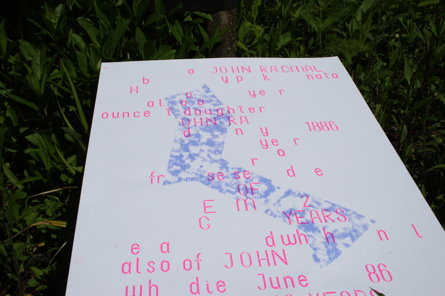
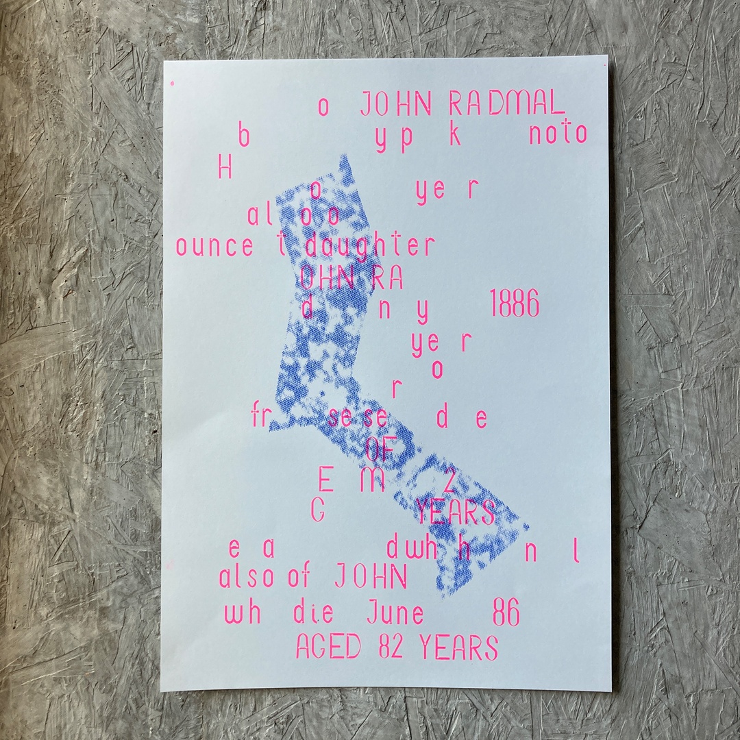
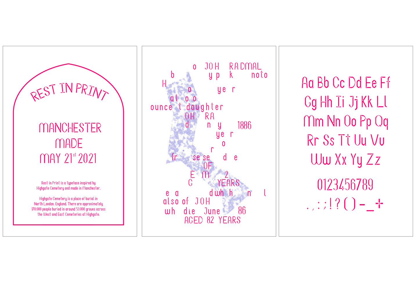
For my final project I created my first ever typeface, titled Rest In Print. The typeface was inspired by North London's Highgate Cemetery. The character set features elements directly inspired by the gravestones at the cemetery, many of the letters have a grave like pointed arches and circular indents inspired by the Celtic crosses littered throughout the cemetery. The final presentation of the typeface is a poster series that I have screen printed. The 1st poster is informational, the 2nd is typeset to an eroding grave I came across on my trip to Highgate Cemetery and the 3rd is the final character set. I chose to screen print as I wanted to use neon colours to represent the modern architecture that sits in the top right corner of the cemetery and can be seen sitting amongst the gravestones, this is also reflected in the abstract blue imagery in the 2nd poster in the poster series.
Send me an email/message if you're interested in using this typeface :)